A Control Chart is a statistical tool used in the field of process improvement, specifically in Lean Six Sigma methodology. It is used to monitor and control a process over time by tracking data points over a period and comparing them to established control limits.
The chart is comprised of a series of data points plotted over time, with a central line representing the average or mean value of the data points. The upper and lower control limits are also plotted on the chart, which represent the range of values that are considered acceptable for the process, i.e., the bands between the values measured from a process can vary.
The purpose of the Control Chart is to identify when a process is moving out of control, meaning it is no longer producing results within the established limits, for example, the quality issues of a production line are increasing beyond the upper limit. When this happens, the process can be analyzed to determine the source of the problem and corrective action can be taken to bring it back into control.
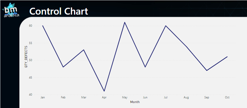
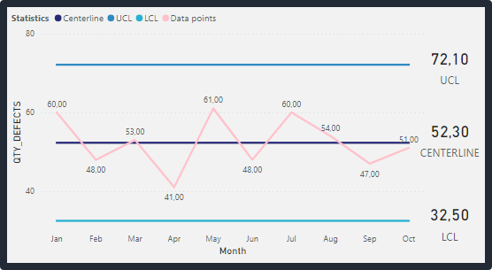
Below, you can see an example of a control chart:
Fig 1: Control Chart. Font: created by the author.
As you can see, the measurement samples retrieved from the process are plotted over a certain period (day, week, month, etc.). The centerline as well as the upper and lower limits are calculated using those historical data points.
Centerline: This is the horizontal line in the middle of the chart that represents the average or mean value of the data points.
Upper Control Limit (UCL) and Lower Control Limit (LCL): These are the horizontal lines that are plotted above and below the centerline, respectively. The UCL and LCL represent the upper and lower limits within which the process should be operating. These limits are designed to ensure that the process is stable and predictable. They can be calculated as following:
UCL = Centerline + (3 x Standard Deviation)
LCL = Centerline – (3 x Standard Deviation)
Note that the value of “3” in these formulas is a commonly used value for setting the control limits, but it can vary depending on the specific process and data being analyzed.
PS: this introduction was made with the aid of ChatGPT.
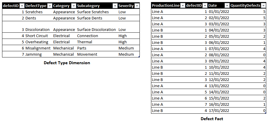
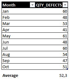
Sample Database
The data used in this article was also generated using ChatGPT. The idea was to simulate defects captured on a production line. Below you can see the data generated:
Fig 2: Database sample. Font: created by the Author.
The prompt used to generate it was:
You are a Quality Engineer in a big manufacturing company. You are responsible for getting all the data from the production lines and put it together into spreadsheets. Your main focus is to identify defects. You also know a lot about the star schema data model and you have design your data tables to match this schema. Can you create a sample database containing the dimensions and fact tables for defects from different productions lines?
Also, we extended the prompt asking for the samples on each table asking for ChatGPT:
can you generate sample data for each table?
Then, using the fact table as a template, we extended it using Excel.
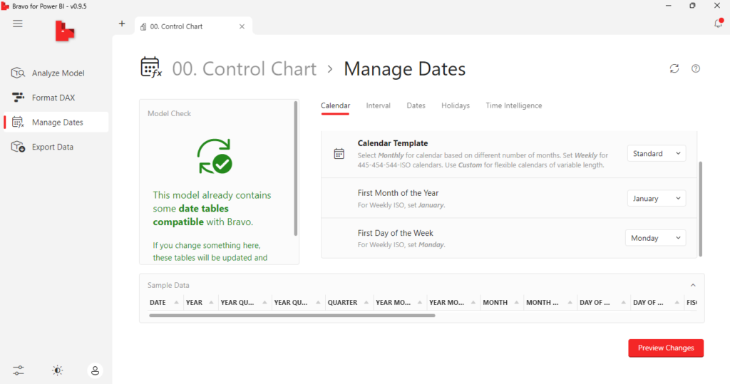
For the date table, we used Bravo (an External Tool created by SQLBI) to automatically create it.
Fig 3: Creating the date table using Bravo. Font: created by the Author
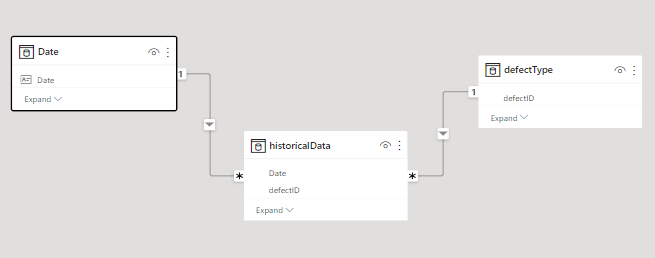
The final data model is very simple and you can check below:
Fig 4: Data Model. Font: created by the Author.
Building the Control Chart in Power BI
First, let’s build a measure to show the historical data points. The idea is to be able to navigate over the hierarchies. Then, we can retrieve data points using the following measure:
Dropping the measure into a visual containing the month on X-axis, we can have the following result:
Fig 5: Data points trend line. Font: created by the Author.
We need to retrieve the centerline, the upper (UCL) and lower (LCL) control limits. Things start to get interesting right now because we need to perform the calculations over the historical data presented in the chart.
Let’s create the measure for the centerline, which is the average/mean of the points. If we get all the data points on a monthly basis we expect to have the following data:
Fig 6: Average over the months. Font: created by the author.
Thus, we’re looking for a mean of 52.3. In DAX, we can retrieve the average using the following formula:
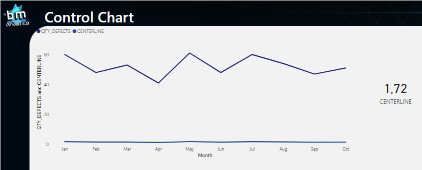
Dropping the measure in the visual and also putting it in a card, we have:
Fig 7: Centerline measure on the visual. Font: created by the author.
As we can see, the numbers are not equal to what we were expecting on Fig 6. The centerline on the visual is very far away from the data points and the general average is not 52.3 (as we can see in the card). The reason for that is the filter context which that is being applied on the calculation.
The AVERAGE() DAX formula is performing an average over all the records. This means that for the 1.72 value on the card, the DAX Engine is running the average over all the records on the table (once we do not have any extra filters applied). For the visual, we can see a small difference on the average each month, which means that DAX Engine is calculating the average on the records within each month (i.e., the filter context is being applied here).
However, what we expect is to SUM() all the defects of a particular month and, for all the months, take the average. This means that we will have to play a little with the filter context using some DAX.
The main idea is to virtualize a table containing the months, for each month calculate the sum of defects and over this table perform the average. The following formula can do that for us:
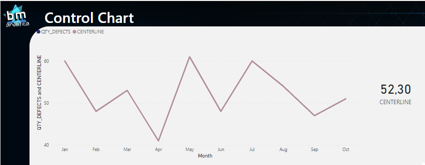
Dropping the measure on the visual and on the card, we have:
Fig 8: Centerline V2 applied on the visual. Font: created by the author.
Even though the value on the card is the one we expect, we notice that the centerline on the chart is overlapping the data points line. Analyzing the previous DAX measure in more detail, this is an expected result once the VALUES() formula will retrieve the months on the filter context.
For the card, this will be all the months on the visual (or on the slicer if just a few months are selected) while on the visual, the month retrieved by the formula is the month itself. Then, in order to make a straight line containing the right value, we need to remove the filter context generated by the month on x-axis on the visual while we keep the filter context from any other filter applied over the months (a slicer for example). We can build the following measure:
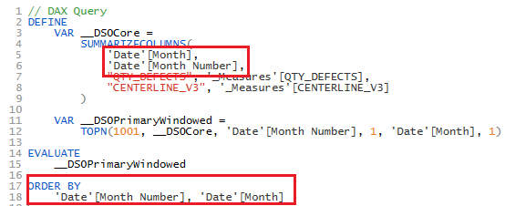
In the measure above, the ALLSELECTED() DAX Formula is used in order to retrieved only the months that are being used on visual. This formula is very tricky and must be used with caution (more details in this article from SQLBI). Also, as you can see, we need to include as arguments on this formula not only the Date[Month] column but also the Date[Month Number]. That’s because the Month column is sorted by the Month Number one (more details in this article also from SQLBI). We can check this happening by extraction the query generated on the visual and pasting it on DAX Studio.
Fig 9: DAX Query retrieved from the visual. Font: created by the author.
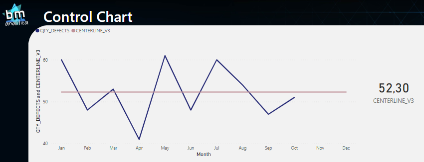
Checking the visual and the card, we can see that we have achieved the expected outcome.
Fig 10: Centerliner using ALLSELECTED(). Font: created by the author.
One thing to note on the visual above is that the line is stretching over months with defects not yet measured (November and December). Tough, to treat this, we can apply the following condition on our DAX Measure:
CENTERLINE_V4 =
VAR maxDate =
EOMONTH(
    CALCULATE(
        MAX(historicalData[Date])
        ,ALLSELECTED('Date'[Month],'Date'[Month Number],'Date'[YearMonthNumber])
    )
    ,0
)

VAR minDate =
CALCULATE(
    MIN('Date'[Date])
    ,ALLSELECTED('Date'[Month],'Date'[Month Number],'Date'[YearMonthNumber])
)

VAR selDate = MAX('Date'[Date])

VAR RESULT=
CALCULATE(
	CALCULATE(
    	AVERAGEX(
    	    VALUES('Date'[YearMonthNumber])
    	    ,[QTY_DEFECTS]
    	)
    	,ALLSELECTED('Date'[Month],'Date'[Month Number],'Date'[YearMonthNumber])
	)
	,'Date'[Date]>=minDate
	,'Date'[Date]<=maxDate
)

RETURN
	IF(
		NOT ISINSCOPE('Date'[Month]) && NOT ISINSCOPE('Date'[YearMonthNumber]) && NOT ISINSCOPE('Date'[Year])
		,RESULT
		,IF(selDate <= maxDate && selDate >= minDate,RESULT)
	)
The code above is much more complex than the previous one. Basically, we’re retrieving which are the minimum and maximum dates over all the selected dates (variables minDate and maxDate).
For the minimum date, we’re considering that our calendar table will start from the minimum date contained in our fact table – this means that no special treatment is required, it’s just a matter of getting the MIN().
On the other hand, for the maximum date, we can have a calendar containing the full year, which means that dates in the future (without measurements) may be found. Then, we have to capture the maximum date from our fact presented in our filter context – and we can take advantage of DAX Auto-Exist to do that.
With both dates, in our RESULT variable, we can build a filter context (containing the dates from the calendar) outside an inner filter context (keeping all selected dates from this shadow filter created). Then, we materialize month by month, get the total amount of defects and take the average over all of these months.
On the RETURN, we can just do a comparison if the month on the current filter context (variable selDate) is between min and max dates.
Last but not least, we included a condition to show the result whenever the measure doesn’t have the month, year or month-year columns on its filter context by using the ISINSCOPE() DAX formula. Not having this condition, will generate a BLANK() value on the cards once the selDate will get the maximum date – December/22 – making the if statement out of desired range (and returning the blank).
Fig 11: Centerline measure adjusted to avoid months without measurements. Font: created by the author.
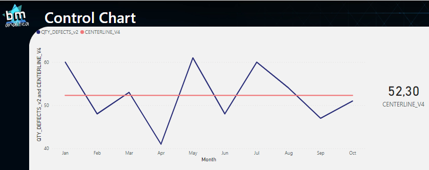
Despite already having a nice chart with a centerline, our measure is not yet fully functional since it does not consider cases when in a particular month no defects were measured, which should consider 0 defects.
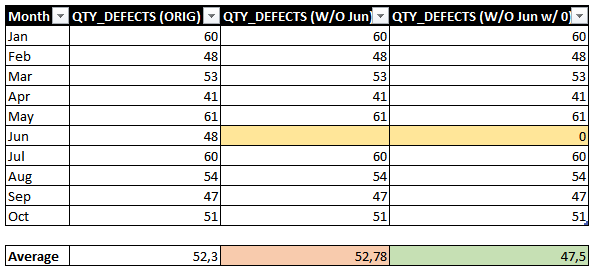
By default, if a month is not present in the fact table, it will be blank and the month will not be shown on the visual. This will lead the formula to miscalculate the correct average (figure below simulated without measurements in June).
Fig 12: Average over months considering blank and zero. Font: created by the author.
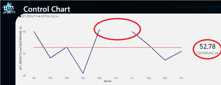
To account for this issue, let’s arrange our data and remove the data from June (in Power Query we can remove this month). Below, you can notice what happens with the centerline measure and the data points. For the first one we have a miscalculation – the correct number should be 47.5 and not 52.78 (the blank is not considered 0 by the engine) – and for the second, we have a gap on the visual.
Fig 13: Measure errors due to the lack a June's measurements. Font: created by the author.
For solving this issue, we need to make a few adjustments at the QTY_DEFECTS measure. Basically, if it’s blank, we want to put it as zero. We can start trying something like the one below:
Fig 14: First try to adjust the QTY_DEFECTS measure. Font: created by the author.
However, notice the behavior for the future months which doesn’t have yet measurements: the formula is also considering 0 (for those, we want to keep the blank, making those later months disappear from the axis). We can apply the same condition used previously for the CENTERLINE_V4 measure, filtering only month before the latest date presented on the filter context:
QTY_DEFECTS =
VAR maxDate =
EOMONTH(
CALCULATE(
MAX(historicalData[Date])
,ALLSELECTED('Date'[Month],'Date'[Month Number],'Date'[YearMonthNumber])
)
,0
)
VAR minDate =
CALCULATE(
MIN('Date'[Date])
,ALLSELECTED('Date'[Month],'Date'[Month Number],'Date'[YearMonthNumber])
)
VAR currDate = MAX('Date'[Date])
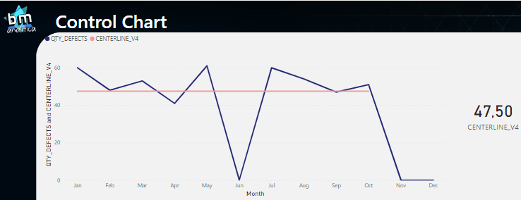
VAR result = IF(currDate >= minDate && currDate <= maxDate,SUM(historicalData[QuantityDefects])+0)
RETURN
result
Then, as we can see, the centerline will match the desired output on the chart and on the value:
Fig 15: QTY_DEFECTS measure adjusted, given the final result for the centerline. Font: craeted by the author.
Once defined the final formula for the Centerline, we can extend it to the Upper and Lower Control Limits. To do that, we can simply change the DAX measure that does the inner calculation of the statistics, this means, change the AVERAGE for the Standard Deviation. Below you can check the DAX Measure:
STD_DEV =
VAR maxDate =
EOMONTH(
    CALCULATE(
        MAX(historicalData[Date])
        ,ALLSELECTED('Date'[Month],'Date'[Month Number],'Date'[YearMonthNumber])
    )
    ,0
)

VAR minDate =
CALCULATE(
    MIN('Date'[Date])
    ,ALLSELECTED('Date'[Month],'Date'[Month Number],'Date'[YearMonthNumber])
)

VAR selDate = MAX('Date'[Date])

VAR RESULT=
CALCULATE(
	CALCULATE(
    	STDEVX.S(
    	    VALUES('Date'[YearMonthNumber])
    	    ,[QTY_DEFECTS]
    	)
    	,ALLSELECTED('Date'[Month],'Date'[Month Number],'Date'[YearMonthNumber])
	)
	,'Date'[Date]>=minDate
	,'Date'[Date]<=maxDate
)

RETURN
	IF(
		NOT ISINSCOPE('Date'[Month]) && NOT ISINSCOPE('Date'[YearMonthNumber]) && NOT ISINSCOPE('Date'[Year])
		,RESULT
		,IF(selDate <= maxDate && selDate >= minDate,RESULT)
	)
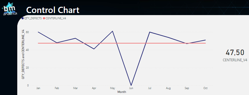
As we can see, the only difference from this measure to the one used to calculate the centerline is the statistics used. On this, we are using the STDEVX.S(). Below we can see the result:
Fig 15: Centerline and Standard Deviation Line. Font: created by the author.
As we can see, the line of the standard deviation is there and matches the expected result. Then, to create the UCL and LCL we just need to multiple it by +3 / -3, respectively.
UCL =
VAR _centerline = [CENTERLINE_V4]
VAR _stdDev = [STD_DEV]
VAR _result = _centerline+3*_stdDev
RETURN
    _result
LCL =
VAR _centerline = [CENTERLINE_V4]
VAR _stdDev = [STD_DEV]
VAR _result = _centerline-3*_stdDev
RETURN
    _result
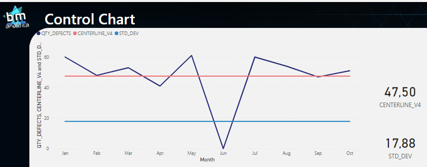
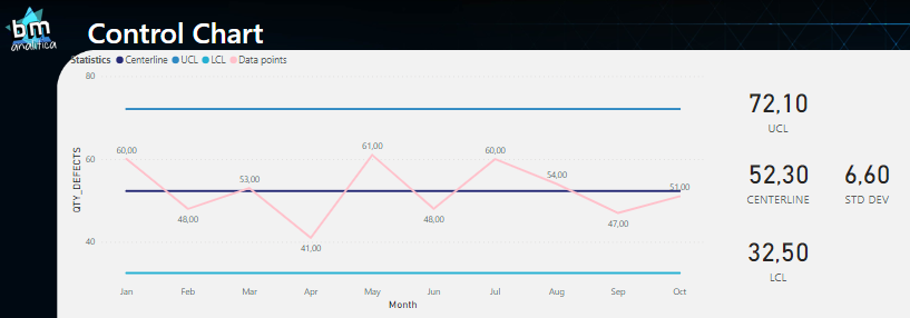
Putting al the measures together on the visual, we get:
Fig 17: Complete solution of the Control Chart. Font: created by the author.
As we can see, the zero that we added in June is creating a big distortion over the Standard Deviation (as expected). We can return the June month that we filtered and take a look on the complete solution:
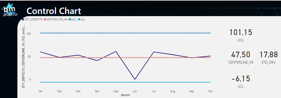
Fig 18: Complete solution for the Control Chart with June filled. Font: created by the author.
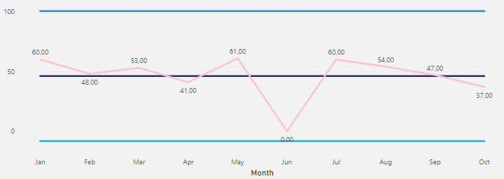
Thus, as we can see, our data is on control once all the points are between the UCL and LCL.
Making the Control Chart Adjustable to Any Measure
One can quickly infer that all the measures created in the previous section will only work for the SUM() of defects.
What if the user wants to apply the control chart on a different measure? To do that, we would need to create 5 more measures to him/she (data points, centerline, standard deviation, UCL and LCL) for each measure to be evaluated. But, anticipating this need, we can notice that the measures created will be nothing more than the same pattern replicated. Thus, whenever we have a pattern, we can leverage the Calculation Group to make it dynamic, i.e., to make it able to be applied over any measure we want in the data model (if you don’t know what a Calculation Group is, check this other article in which we explain in detail).
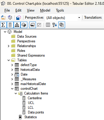
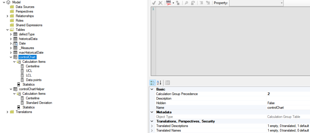
To build the Calculation Group, we can launch the Tabular Editor from the External Tools ribbon and then build our calculation group:
Fig 19: Calculation Group setup. Font: created by the author.
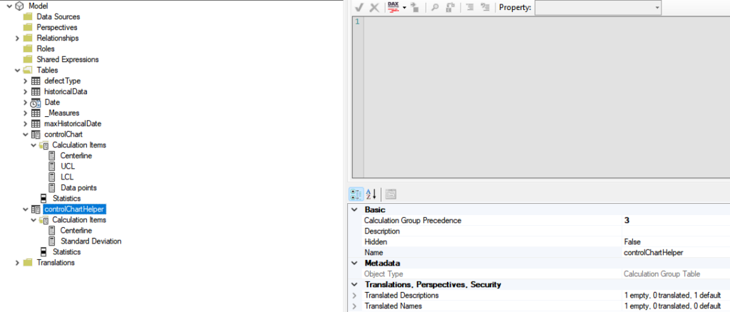
However, notice that we have a problem. The centerline and the standard deviation, which are a calculated items, are also used within other calculation items, the LCL and UCL.
To overcome this problem, we will have to play with the Calculation Group precedence. Basically, we can use another calculation group in which we will setup those calculation items. Then, we can also setup the precedence of this second calculation group to be lower than the first one.
This means that this calculation group will be applied first during the query execution. Then, on our calculation item for LCL and UCL, we can call those calculation items directly through a CALCULATE statement. To finish and guarantee that everything is adjustable, we can replace the measure used for data points for the SELECTEDMEASURE() one.
Below, you will be able to find not only the precedence setup but also the codes within each calculation item:
Fig 20: Calculation Group created to support the metrics calculation on the main Calc. Group. Font: created by the author.
Fig 21: Calculation Group for the Control Chart. Font: created by the author.
One should pay attention to the Calculation Group Precedence value for each one of them.
On the controlChartHelper calculation group, the calculation item is basically the pattern developed on the previous section. For the second Calculation Group, below you’ll find their codes:
UCL =
VAR _centerline = CALCULATE(SELECTEDMEASURE(),controlChartHelper[Statistics]="Centerline")
VAR _stdDev = CALCULATE(SELECTEDMEASURE(),controlChartHelper[Statistics]="Standard Deviation")
VAR _result = _centerline+3*_stdDev
RETURN
    _result
LCL =
VAR _centerline = CALCULATE(SELECTEDMEASURE(),controlChartHelper[Statistics]="Centerline")
VAR _stdDev = CALCULATE(SELECTEDMEASURE(),controlChartHelper[Statistics]="Standard Deviation")
VAR _result = _centerline-3*_stdDev
RETURN
    _result
Data Points=
SELECTEDMEASURE()
Notice that we used the same pattern from the UCL and LCL on the main calculation group centerline item. The reason for that is to have only one single place to go to change the logic behind the centerline (the second calculation group).
As a final result, we can place only the Data points on the trend line visual and then apply the Calculation Group over the Legend field, getting the following result:
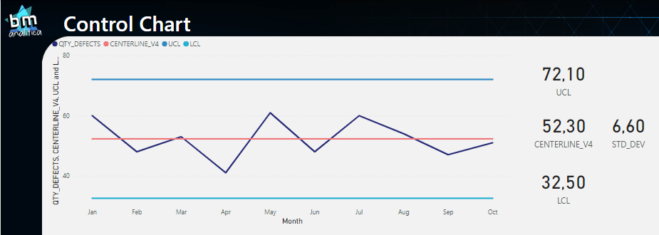
Fig 22: Control Chart with the Calculation Group applied. Font: created by the author.
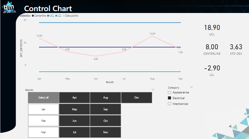
Last but not least, we can apply more filters on our report, checking if our Control Chart is dynamic and varies according to the filter context. Applying a filter from the defectType table, we have:
Fig 23: Control Chart sliced & diced. Font: created by the author.
As we can see, the Control Chart adapts itself when we filter the Category of the defectType table and also filtering out the first months of the year. Moreover, notice that, even tough we have the months up to the end of the year, data for Electrical issues goes up to September only – and is the last month. Thus the code will also adapt itself for this situation.
One last remark: all the calculations above were made doing a selection over months within a year. Having only Month and Month Number on the ALLSELECTED() statement, could cause a summation of values of the same month from different years.
In order to avoid this issue, we can include the year on the axis, drilldown to month on the visual and include the year column from the date table on the ALLSELECTED(). Already thinking about the situation, we included in those calculations the Year-Month-Number column. Thus. if needed, we can just switch from the month on the x-axis to this one to make the trend over more than one year.
That's all for today folks!
Well well well, that’s all for today folks. I really hope that this article becomes useful to you. Please, if you liked this solution or find any issues on it, let me know on the comments below!
Bye bye
Have this article helped you and wanna appreciate it? Check below how to do that!