How to build a Slope Chart using Native Visuals in Power BI

Introduction A few weeks ago, I was reading a very interesting article about Data Visualization related to best practices and which charts to use in each situation. For those interested…
Content related to DAX for Power BI
Introduction A few weeks ago, I was reading a very interesting article about Data Visualization related to best practices and which charts to use in each situation. For those interested…

Introduction In this blog post, we will cover a technique used to remove undesired records from a matrix visual in Power BI. In fact, not only on matrix visuals, but…
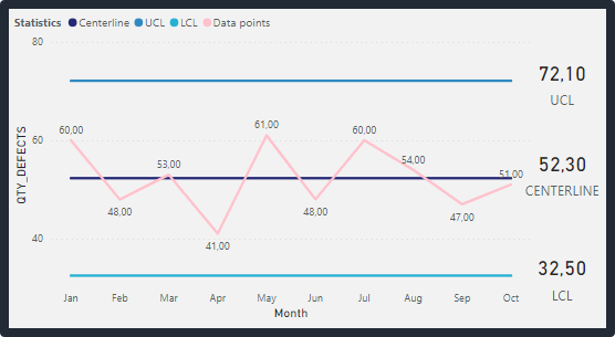
What is a Control Chart? A Control Chart is a statistical tool used in the field of process improvement, specifically in Lean Six Sigma methodology. It is used to monitor…

Introduction Why we would like to create Calculation Groups within our Data Model? Let’s just imagine that we’ve got a model containing several different Fact Tables that are doing a…