
Introduction
A few weeks ago, I was reading a very interesting article about Data Visualization related to best practices and which charts to use in each situation. For those interested in reading it, here is the link [https://www.datawrapper.de/blog/chart-types-guide] for it (I got it from an amazing Newsletter from the Data Hackers, which you can subscribe here).
One of the charts that most attracted my attention was the Slope Chart. Quoting the blog post, a slope chart is:
Think of it as a line chart where everything between the first and last date has been erased. They can be a good choice if the ups and downs of how a line evolved are just not that interesting. Similar to small multiples, they can also help tidy up an otherwise-messy line chart.
What I thought interesting is that this can be a very useful chart to use when we deal with messy trend lines with multiple categories over, especially over long periods. Thinking about it and Power BI, I thought it shouldn’t be much difficult to build it using native visuals from Power BI and a bit of DAX code.
Let’s jump in and check how to implement it.
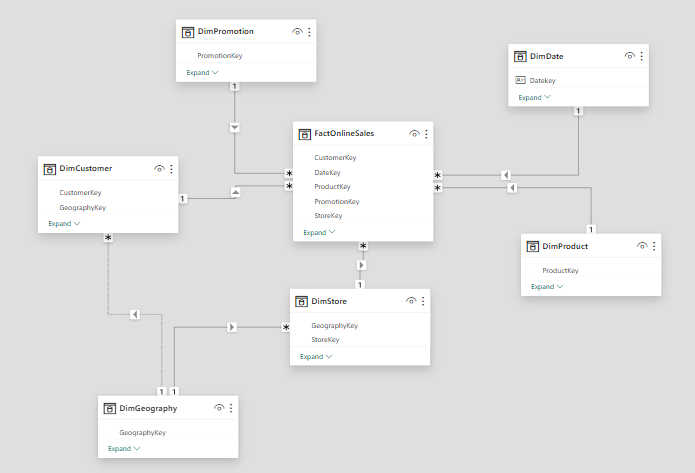
Semantic Model
For this example, we’ll use the good and old Contoso Data Model:
By using this data model, let’s check the trend line of sales broken down by Continent.
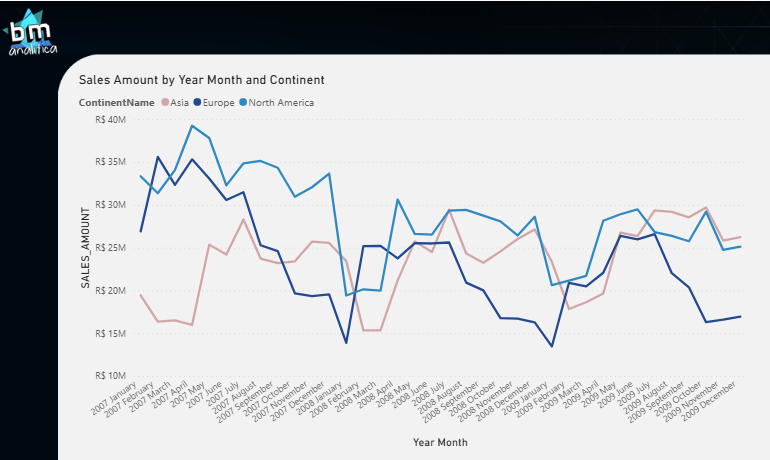
As we can notice, the continents overlap with each other during the months, making it a bit messy and a good case for applying the Slope Chart approach. Let’s imagine that we’re only interested in the start and end points for each Continent on this Analysis.
DAX Code & Data Visualization
To be able to do this, we only need the start and end points of the curves. Anything in the middle should be blanked out. By using some DAX code we must guarantee to pick the start and end year month that are available on the chart for each line.
We must consider what is on the filter context of the chart to pick the right start and end points of each category. This way we’ll be able to guarantee that the data points will be shown as needed. The idea here is to leverage the native trend line visual from Power BI and the DAX Engine, which basically blanks out any category for which the measure result is null (or blank).
The full DAX code for the slope chart can be found below:
SLOPE_CHART =
VAR _minDateGlobal =
CALCULATE(
    MIN(FactOnlineSales[DateKey]),
    FILTER(
        ALLSELECTED(DimDate)
        ,CALCULATE(NOT(ISEMPTY(FactOnlineSales)))=TRUE()
    )
)
VAR _maxDateGlobal =
CALCULATE(
    MAX(FactOnlineSales[DateKey]),
    FILTER(
        ALLSELECTED(DimDate)
        ,CALCULATE(NOT(ISEMPTY(FactOnlineSales)))=TRUE()
    )
)
VAR _currDate = EOMONTH(MAX(DimDate[Datekey]),0)
VAR _result = IF(EOMONTH(_minDateGlobal,0)=_currDate || EOMONTH(_maxDateGlobal,0)=_currDate,[SALES_AMOUNT])
RETURN
    _result
The core of this code is the date picker, which means properly selecting for each category which are the start and end year month dates in which we had a sales amount. This is tricky because we can not simply use the a MAX() or MIN() over the Calendar table, as we usually do, like below
CURRENT_DATE =

VAR _currDate = MAX(DimDate[Datekey])

RETURN
    _currDate
This code is useful only to pick the current date on the filter context. In our case, we have to pick the “Global Minimum/Maximum Dates”. Not only that, but if our calendar table encompass more dates than the fact table (a plausible scenario when dealing with multiple fact tables on the same semantic model or working with forecasts/projections), then we MUST ALSO consider only the dates which ARE PRESENT on the fact table.
That’s why you might think that this code is a bit complex, because we’re considering these edge cases scenarios and protecting the business logic applied on our measure (and possibly saving us from end users calling us angry saying numbers don’t make sense).
Thus, to comply with this requirements, we do a MAX() over the Fact Date column (FactOnlineSales[DateKey]) and we ensure to do that for ALLSELECTED() dates on the calendar, which can be found on the fact table (NOT(ISEMPTY())).
The result can be found below:
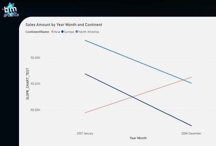
As we can see, we’re able to implement a Slope Chart in Power BI only using native visuals. If you want to extend this to any measures on your semantic model, I’d suggest you create a calculation group with this same pattern.
Final Thoughts
Well well well, that’s all for today folks! Hope you’ve liked this implementation and hope that this might be useful for you somehow!
See you on the next,
Cheers,
João Martins