Tooltips are a very useful feature in Power BI to extend the insights generated by a visual in a report. However, in the same way they can increase user’s insights, they also have a very low interactivity.
In this short blog post, we’re going to play a little bit with the tooltips and demonstrate a technique that can help us change how the tooltips are sliced and diced on a report, giving back to the user the ability to make deeper analysis and dynamically adapt them.
How to setup tooltips
First, let’s get our Contoso data model and build a trend line chart.
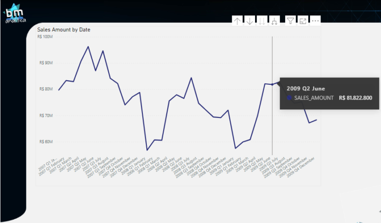
Fig 1: a Regular trend line. Font: created by the Author.
As we can see in the figure above, when we place the cursor above one data point on the trend line, a box pops-up with the data point details. That is a tooltip!
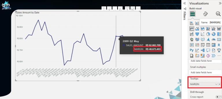
We can extend the information that is shown in the box by placing more measures on the “Tooltips” field in the Visualization Pane when the visual is selected.
Fig 2: Trend line with more details on the tooltip. Font: created by the author.
Thus, you can notice that we placed the MARGIN measure on the Tooltips field, which is then shown on the same data point selected in the visual.
Extending the tooltip capabilities
In order to extend the capabilities and create more insights when users are analyzing the data, we can build a custom tooltip in an exclusive Power BI page and associate it with a specific visual/chart.
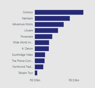
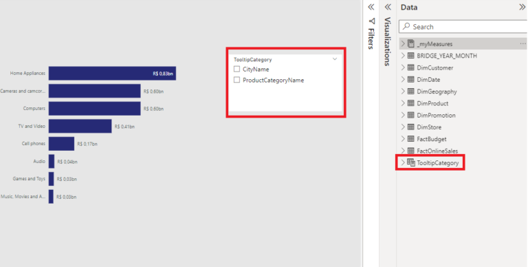
Let’s start creating a new page and building a simple pareto chart with the SALES measure, like the one below:
Fig 3: Pareto Chart with sales sliced by Product Category. Font: created by the Author.
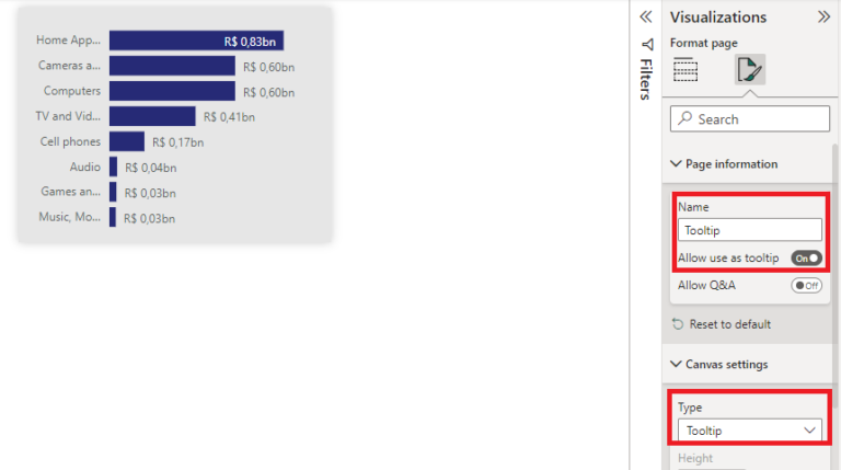
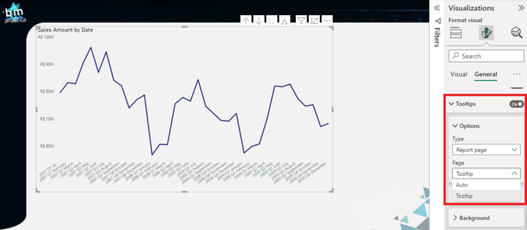
Now, we need to setup the page to be used as a tooltip. To do that, on the Visualization Pane we can go on the Page Information bucket and enable the “Allow use as tooltip” feature. We can also setup the size of the canvas background to fit the tooltip size on the Canvas Settings bucket.
Fig 4: Page settings for tooltip setup. Font: created by the author.
Back to our chart, we can select it and on the Visualization Pane, select the Format, General settings and then the Tooltip bucket. Expanding the tooltip bucket, we can select the “Report Page” on the Type and on the page dropdown we can select the page name that we’ve just created.
Fig 5: Tooltip setup on the chart. Font: created by the author.
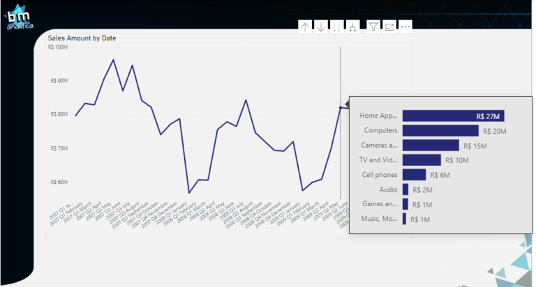
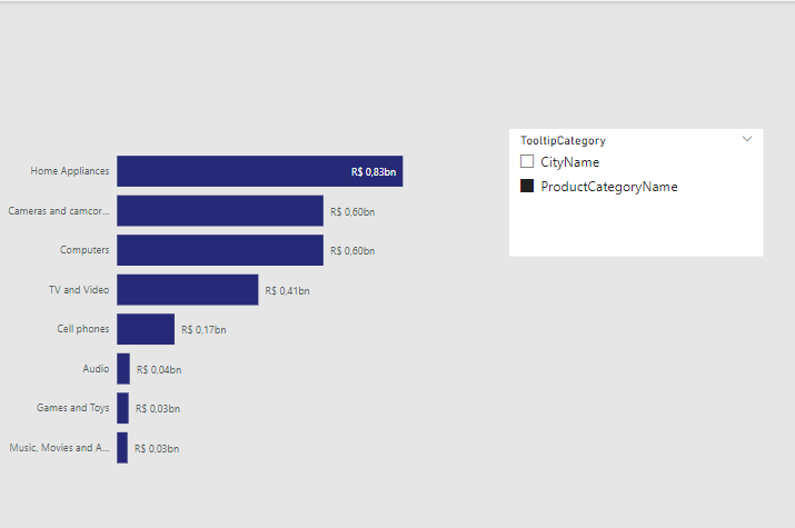
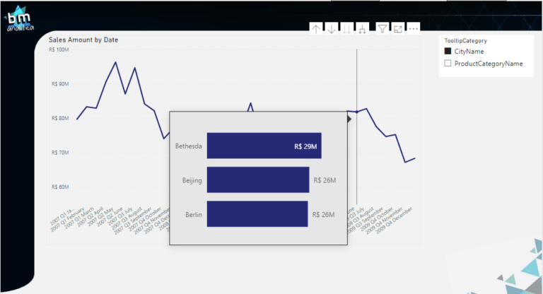
Then, when we place the cursor over a data point, we get the following result:
Fig 6: Tooltip page applied on the chart. Font: created by the Author.
As you can see, the tooltip pops-up extending the insights generated by the data point selected. In this case, a pareto chart with the Product Category Name is shown for the selected date on the chart.
Making the Tooltip Dynamic
Willing to give more flexibility for the user analysis, we can think to have more pareto charts so the user can have different ways to see which are top dimensions with the highest sales impact. However, if you noticed on Figure 5, we can only select one single page to be used as tooltip.
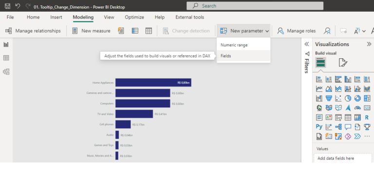
Thus, in order to make this work, we need somehow to use the same Pareto Chart but with the ability to dynamically change the dimension used on its axis. A very nice way to do this is to use Field Parameters, which allows to change how we slice and dice a visual.
In this example, let’s assume that we want to see the Pareto chart by Product Category (the one already implemented) but also by City Name. Let’s first create the field parameter containing both columns. To do that, let’s go to the top ribbon, on the Modelling tab, select the New Parameter bucket and then Fields.
Fig 7: Field Parameters setup. Font: created by the author.
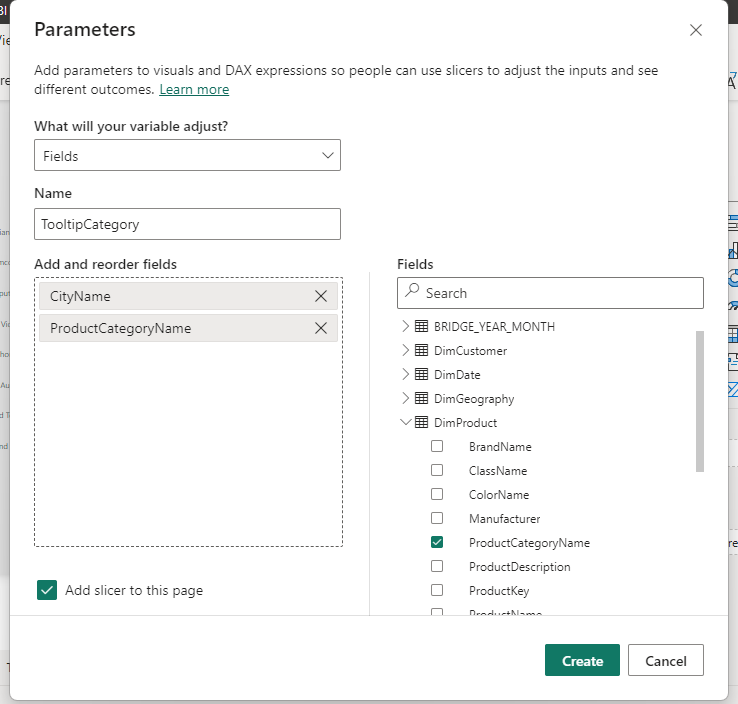
Once the wizard opens, let’s give a name for the parameter and drag and drop the columns we want to use on it (Product Category from the Products table and City Name from the Geography table).
Fig 8: Field Parameters columns selection. Font: created by the author.
After hitting Create and having selected the option “Add a slicer to this page”, a new table will be created on the model (a table that will host the parameters) and a new slicer will appear on the Canvas
Fig 9: Field Parameters applied slicer. Font: created by the author.
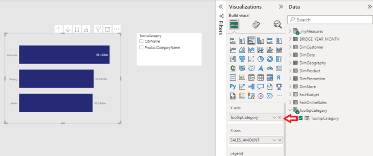
Now, instead of placing a column from the Dimension Table on the Pareto Chart, we can use the column from the parameter table just created.
Fig 10: Field Parameter column placed on the Pareto axis. Font: created by the Author.
As you can see, the axis of the Pareto chart has changed for the fist column included on the field parameter (the CityName). Then, we can use the slicer already placed on the canvas to dynamically change the columns used to aggregate the data on the chart. On the example below, we selected the ProductCategoryName on the slicer and the axis on the chart has dynamically changed based on this selection.
Fig 11: Field Parameter slicer dynamically changing the chart axis. Font: created by the author.
Combining Field Parameters and Tooltips
However, you might be thinking how we will make the tooltip dynamic once it has its own page. The answer is to use a very common Power BI feature: sync slicers.
Let’s first setup our tooltip page with the parameters we have just created. On the tooltip page, let’s change the column on the chart axis for the one from the Parameter Table and let’s also put a slicer on the canvas with the parameter options:
Fig 12: Tooltip Pareto Chart with the Field Parameter. Font: created by the author.
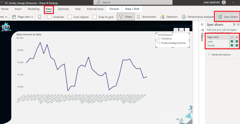
Let’s then place the same slicer with the Parameter column on the main page which has our trend line chart (to help with the syncing, we can copy and paste the slicer from the tooltip page into the main one). Once pasted, we can go on the top ribbon, on the View tab and select Sync Slicers (be sure to have also the slicer on the page selected):
Fig 13: Creating a slicer on main page with the field parameter. Font: created by the Author.
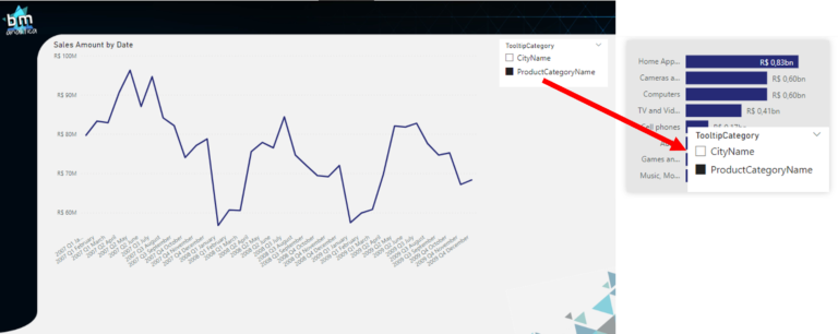
On the right panel, we can notice that both slicers (one on each page) are visible (checkmark on the eye) and are synced with each other (checkmark on the circled arrows). To check if the syncing is working, we can then select on the main page an option in the slicer and go to the tooltip page and see if it was reflected:
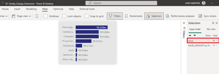
Once our synced slicers are working, we can hide the slicer on the tooltip page to not overlap the Pareto Chart. To do that, we can just go on the top ribbon, View tab and select the “Selection” option. A new panel on the right will appear with all the artifacts available on the canvas. Then, we can just click on the eye ball next to the Slicer artifact name to hide it:
Fig 15: Synced slicers on the tooltip page. Font: created by the author.
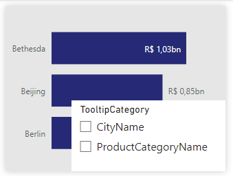
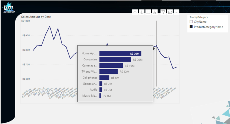
We’re ready to test our solution! Going back to the main page, let’s select a category on the slicer and hover over the chart. Later, we can select the other category and hover again to see if the Category used as axis on the Pareto Chart has changed:
Fig 16: Selecting the Product Category on the slicer. Font: created by the author.
Fig 17: Selecting the City Name on the slicer. Font: created by the author.
As we can see, depending on what is selected on our slicer, the category used on the Pareto Chart changes.
Conclusion
Well well well,
That’s all for today folks! A quick post to demonstrate a very nice technique to change the tooltip dimension that you can put in your toolbelt. This approach can be very useful when we’re dealing with user’s requirements for more details on their trends while saving a lot of canvas space.
Hope this technique will be useful for you in the future.
Cheers,
Have this article helped you and wanna appreciate it? Check below how to do that!