Storytelling with Data is one of the greatest books for everyone who is working in the Data and Analytics field. Doesn’t matter if your job is more related to a very technical work, like data engineering or machine learning engineering. Once in a while you’ll have to present data in such a way people can easily understand the meaning of it. In the book, Cole Nussbaumer Knaflic demonstrates a series of techniques and concepts that can enrich the way we present data to final customers.
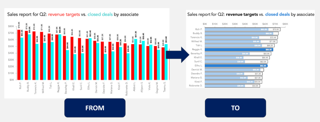
Not only a book, Cole also host a community and have a great newsletter in which some really great content is shared not only by her but also from many others contributors. A few weeks ago, I’ve received the following article (https://www.storytellingwithdata.com/blog/better-than-a-big-bar-chart) in which the author plays with a few different (and better) ways to compare an actual value to a target (or a estimate, or a previous year amount, etc).
Reading the article, came into my mind to try to build the first option the author develops in Power BI (figure below). But, instead of having a transparent bar with borders as target and the actual amount fulfilling it, my idea is to have the filled bar as actual and a lollipop as the target.
Fig 1: From-To the first option made on the article: Font: article mentioned above.
So, let’s dig in and give a try!
Creating the measures
First of all, we’re going to use our old and gold Contoso data model. On it, let’s create two measures: one for the actual amount and another for the previous year amount:
Filtering to only two years, we can see the result of the measures on the table below:
Fig 2: Measures validation using a matrix visual. Font: created by the author.
Building the Lollipop Chart
Now that we have the measure setup, let’s build the Lollipop Chart. For this, let’s assume we want to compare on a bar chart the sales for the current period (a single year filtered on the slicer) against the sales of the previous year grouped by Product Brand.
To do that, we can select the “Clustered Bar Chart” and then drag to the Y-Axis the Product Brand and to the X-Axis both measures we created before. The result is the one below:
Fig 3: Bar chart with Current Sales and Sales Previous Year. Font: created by the author.
But this is not a Lollipop Chart once one bar is next to the other. We’re looking to have one bar over the other.
Thus, to build this Lollipop Chart we will have to be a little creative. A few months ago, the Power BI team released the ability to build “Error Bars” over a Bar Chart. Thus, we can leverage this new feature to prototype what a Lollipop Chart will look like.
First, let’s get rid of the measure containing the previous year amount (our target in this case). Then, selecting the visual, we can go to the Analytics Pane and select the Error Bars feature.
Fig 4: Error bar feature. Font: created by the author.
On this feature, let’s try to first just add the SALES PREVIOUS YEAR measure on the Upper bound and keep the Relationship to measure set as Absolute to see what’s going to happen.
Fig 5: Error bar feature with upper bound. Font: created by the author.
As we can see, the error bar starts at the top of the bar and goes up to the value of the Previous Year.
Well…this is not much what we were looking for. Checking the Power BI documentation, the “Absolute” (on the Relationship to measure) means the exact value of the upper/lower bound whereas the “Relative” will contain the difference between the value and upper/lower bound. This means, if our value is 50, and the error bar is +/- 10, then on the relative we would put the +/- 10 whereas on the absolute would put 60 (50+10) as upper and 40 (50-10) as lower bound.
In our case, we already have the absolute value of our upper bound interval (which is the previous year amount). Thus, to build a “big” error bar, we would just need to have the lower bound, which is the beginning of the bar, in our case, sales equal to zero. Let’s build the zero sales measure as following:
Notice that this formula is a little bit more elaborate because we don’t want to show any Brand without sales. Then, let’s drag this measure to the lower bound placeholder in the error bar configuration pane. In order to validate our final output, let’s also include the SALES PREVIOUS YEAR measure on the visual. The result is the one below:
Fig 6: Low bound calculation and Sales from Previous Year validation. Font: created by the author.
Comparing the error bar with the sales previous year, we can see that both are matching their heights, being the only difference the fact that the error bar is layered over the current sales amount bar.
Removing previous year, we can start playing with the error bar configuration to get the expected final result of the Lollipop Chart.
To begin, let’s select the “Bar” option over the Error Bars settings. Then, select the error bar color and the border color to be teal and let’s increase the width of the bar. Also, let’s change the marker shape to be a circle and increase its size to 8. The result can be seen below:
Fig 7: Configuring the Error Bar. Font: created by the author.
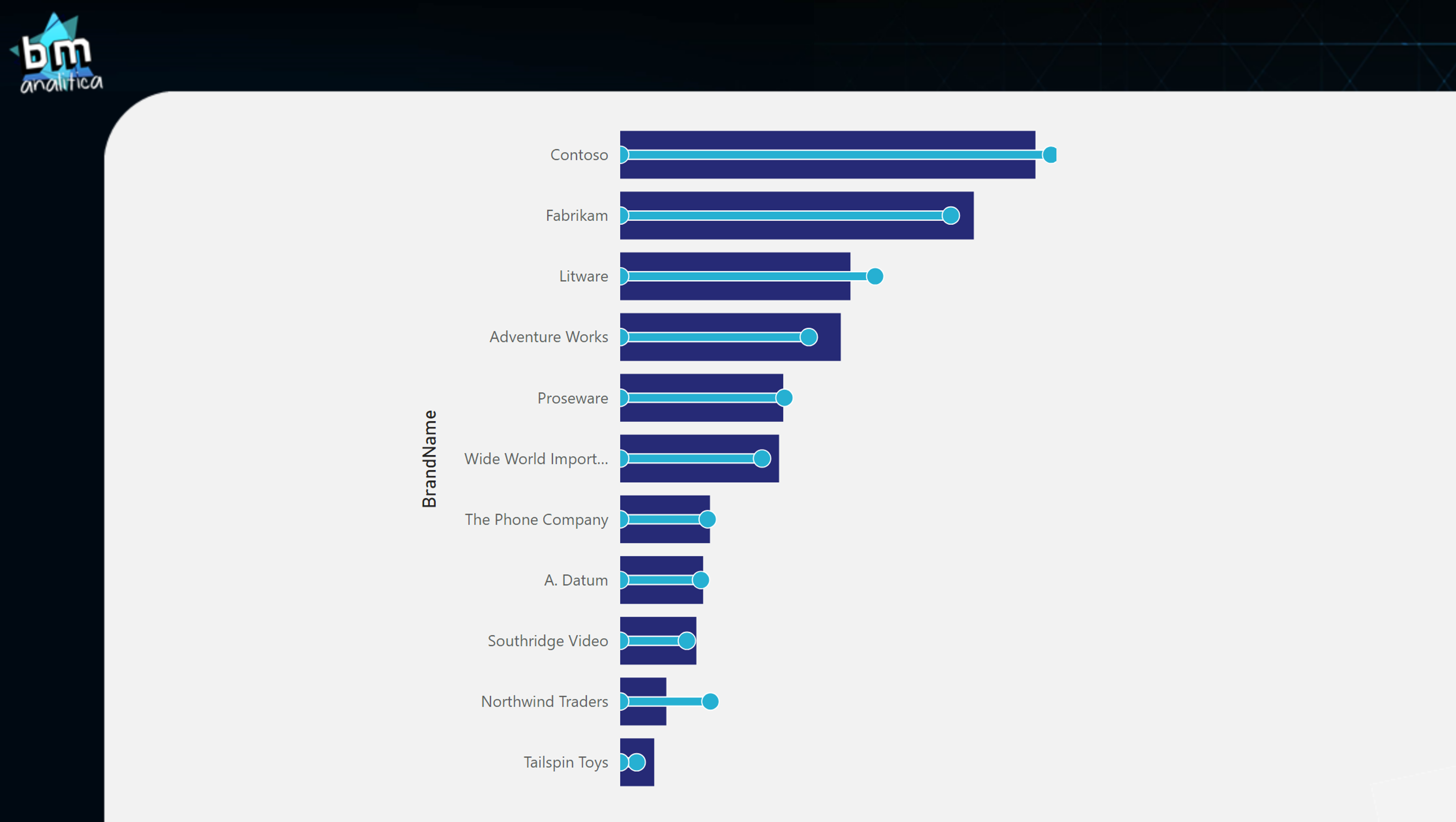
As we can see, the Lollipop Chart is finally created. The only “issue” is that we can not remove the circle over the lower bound limit. But, if this is not a problem to you, then, the Lollipop Chart is ready to be used!
Fig 8: Lollipop Chart. Font: created by the author.
Extra! Extra! Extra!
After playing around with this error bar feature, I realized that we can indeed build the same visualization created in the Storytelling article. This means, instead of using the lollipop to show the target, we can use the bar to show it and then create an inner bar with the current value.
To do that, first we need to change the value on the visualization from Sales Amount measure to the Previous Year Amount measure. Then, same as we did before, let’s include on the error bar settings the Sales Amount as upper bound and the zero sales as lower bound.
Fig 9: Changing the measures on the chart. Font: created by the author.
Lastly, on the Bar settings, let’s change the bar color, the width, remove the shape for the markers and change also the border color and size.
Fig 10: Configuring the error bar. Font: created by the author.
To complete our design and be closer to the visualization created in the article, we can go to the Format Pane, over the Bar settings and on the Spacing we can increase the Inner Padding to 50 px. The result is the one below:
Fig 11: Configuring the bar. Font: created by the author.
Ideally, we would also create some color measures to dynamically change the color of the inner bar to highlight those that are above target. However, unfortunately, we do not have this feature implemented to the error bars yet. Then, we have as final result the following visualization:
Fig 12: Final visual result. Font: created by the author.
Conclusion
Well well well, that’s all for today folks!
As you’ve seen, we used the native visualization from Power BI to develop some different ways of visualizing your data, following some best practices shared over the Data Storytelling newsletter.
Hope you have enjoyed this quick article!
See you on the next post!
Cheers,
Have this article helped you and wanna appreciate it? Check below how to do that!